Orders Page Final

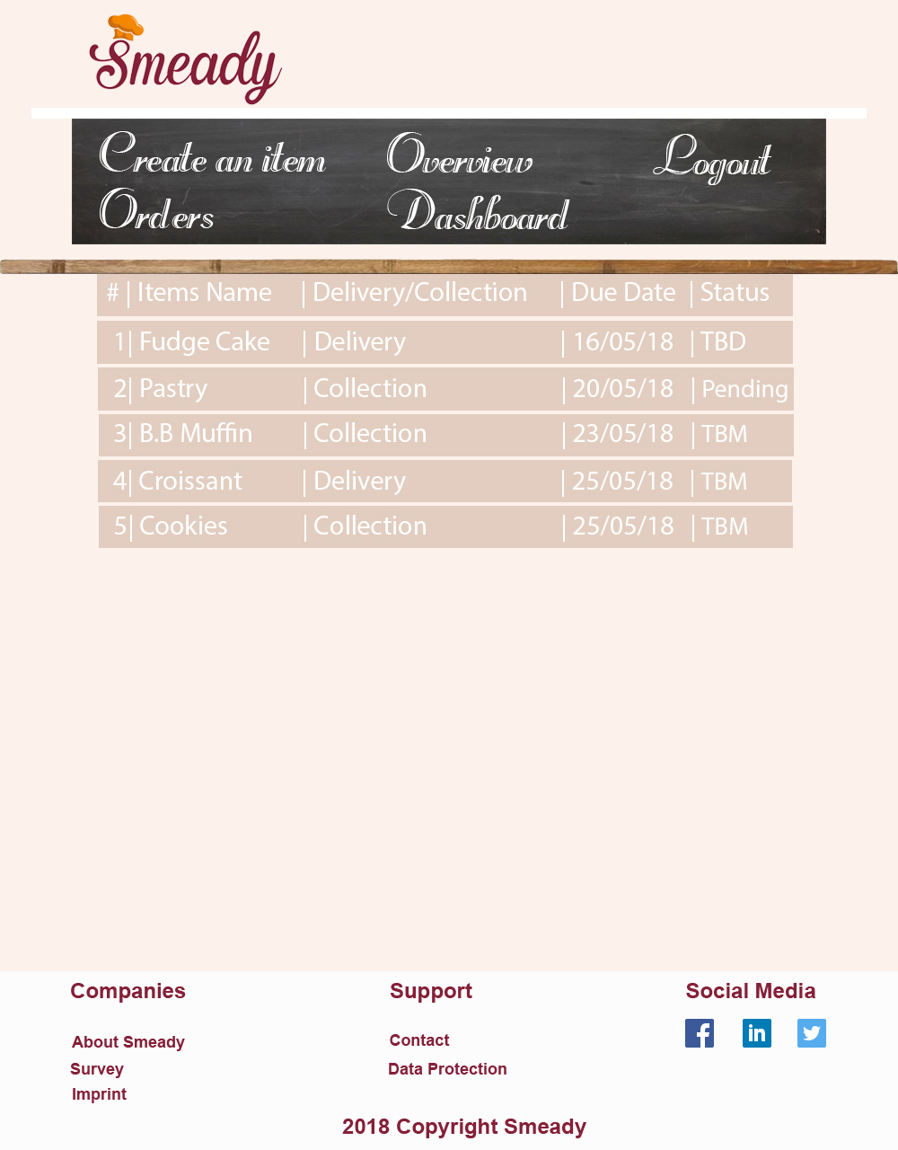
I created the first orders page based on the likes of the Amazon My Orders Page. This was turned down because of the image of the product, this was believed unnecessary by the client and so I got rid of the image. background

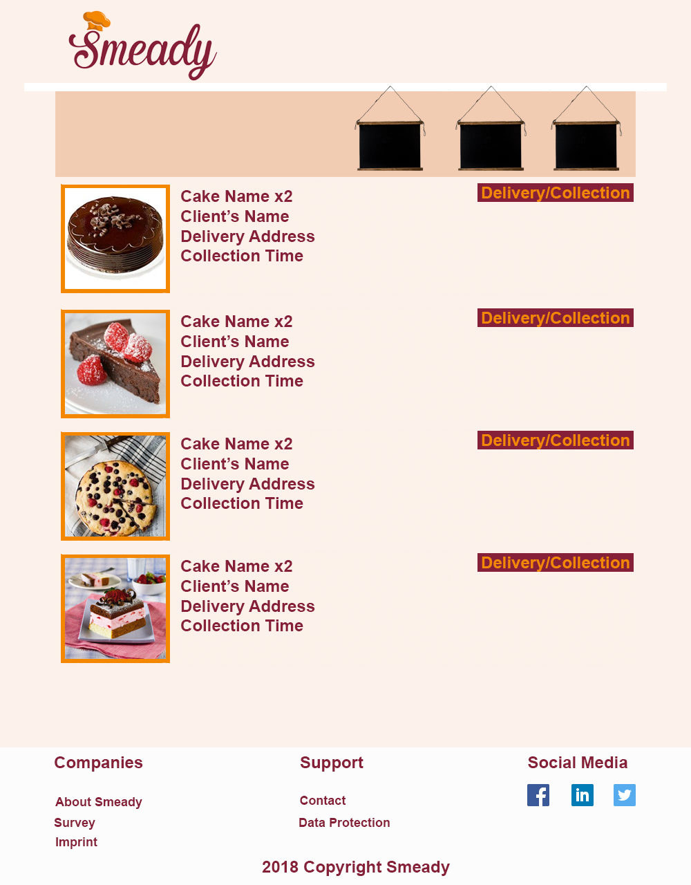
Without the image the space felt empty with just the space so I did an overhaul of the orders page using what the client had told me along with the info partners would need. The simple version below gives the partners the needed information quickly and cleanly without distractions.

orders

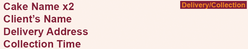
Overhauled imagery. After showing this to the group it was agreed that this was the best out of the varying versions as it’s easy to read and shows the partner when orders have to be in by and their current status. For the customers we kept the same layout as they need all this information as well, specifically the Status update so they may know how the order is coming along. orderspage

Completed Overview

overview

For this Blog, I completed the overview page. The overview page relates to the client’s commercial sales. It keeps them updated about their current products. Therefore it was very important to ensure that the design is well organised, simple and easy to read. I used the same background as everyone used because it would make more sense to continue the design. I also added the imagery from Emma’s work in the items/product page.

-Yanisah Marapao

Completed Profile Page

I modified the Profile page to include more common elements with the rest of the site. The page is now on a blackboard, and the arrangement of the text and profile image has been moved around. I also altered the text to have the same font as the other pages.


Here is a sketch of the new page:

001


And here is the final product:

profilepage.jpg


-Aoife James

Dashboard Layout Research

Dashboards vary website-to-website, ergo creating one for a buy-and-sell interface would be different from, say, our dashboard on this WordPress blog. In my attempts to research effective layouts for this, the majority of results were for social media sites. I eventually came across this blog post that showed me many examples of good dashboard layouts:

https://econsultancy.com/blog/62844-24-beautifully-designed-web-dashboards-that-data-geeks-will-love

Through the multiple examples they provided, I was able to construct one suitable for the Smeady site, utilising our blackboard concept once more.000.JPG


-Aoife James


Completed Create an item page

Today, I completed the create an item page. This page refers to our clients who wish to sell their products and we assist them through this method.

As a team, we decided that it would look better if we continued to have a hanging blackboard in our pages. Therefore I also used a blackboard on this page. Compared to the registration page, we felt that the “create an item” page should be less formal. Therefore, I added some vector dessert doodles that I got from shutterstock and pasted it on blackboard. I also added a arrow button that would lead to the other page of the “create an item” because there wasn’t enough space to fit all the information on one blackboard. Therefore, to navigate the two pages, i added a left and right arrow on the bottom right of the blackboard.

On the second page, I used the vector images, and used them as visual aid to help the client select the category for their product. I also added text at the bottom of each image. I believe that added even the simplest images gives the whole design character.  The client can also publish photos on the bottom section.

createItem_1createItem_2

-Yanisah Marapao

Completed Launch Page

Last week, we received feedback from our lecturer and the team from Germany. They informed us that it would be better to have one whole blackboard navigation bar instead of 3 separate blackboards hanging from a picture rail. So today, I completed the design of the navigation bar that will be present in all of our pages. We also decided to have 2 types of navigation bars.

background_updated

We decided as a team, that having  2 navigating bars will make our website more organised and easy to navigate.  The first navigation bar presents what the website will look like before you login.


The second navigation bar will only be present after a client or a customer logs in their account.

background2_updated

For the second part of my task, I added a cafe/ bakery till at the bottom of the launch page. I also used the Rechtman font (that I previously used on the blackboard) on the title to continue with our blackboard font style. For easy reading, I used a simple yet sophisticated Arial font on the actual body of message.

Launch page

The reason why I used a bakery till with a display table, was because I wanted to ensure that our customers and client knew and understand what kind of website we are. It allows them to understand that we buy and sell dessert through one imagery.  I also feel like it blended with the theme, and it gave the launch page more personality and familiar feeling.

-Yan Marapao


Completed items page

Here is the completed items page with the redesigned filter!

I used the display counter idea, and kept the main layout of the navigation and footer to keep the website consistent. The word products is in the Smeady shade of red to indicate you have clicked it and you are on that page. I redesigned the filter to look like cake boxes on a shelf. When you click the box the lid opens to reveal filter options.

Here is the page with the filter closed:

itemspagefilterclosed.jpg

Here is the page with the filter open:

itemspagefilteropen


-Emma O’Brien