To suit the theme of this dessert website, we thought it would be good idea to incorporate some baking materials into our layout. Including Responsive designs such as dropdown and rollover effects in the html file would make it more creative and different.
Ideas/ Responsive Design:
- Dropdown effect on a rolling pin.
- Eggs rolling across the page.
Colour:
- Red and yellow evoke the tastebuds and stimulates the appetite. Can be very effective when used on their own and/or in different pairings. Red may evoke hunger, but an actual picture of food has more effect
- Fun color combos can be applicable to fun foods like candy.
- White delivers a clean and pure look, but it can also look stark, plain and sterile.
- Wood delivers a sense of comfort and positive feedback
Layout: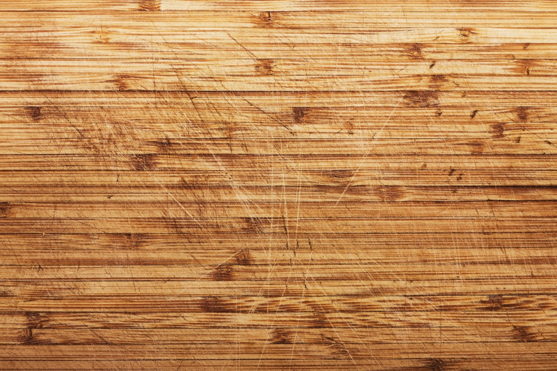


Sources:
http://jenndavid.com/colors-that-influence-food-sales/
Click to access aa11035830e4f066518789b0d1cf7ab4ac52.pdf
- Provides a lot of appetizing imagery.
- Complementing color scheme.
https://www.siftdessertbar.com =
- Targeted audience is obvious.
- Appetizing color design.
-Yan Marapao and Amy Leahy
Further research
I then undertook further research of existing bakery web pages. Here are the pages I looked at:
magnoliabakery.com

- Aesthetically pleasing colour combinations.
- Interesting chain sign design.
stghi.com

- Too text based.
- Not enough imagery to stimulate senses and guide you through the page.
buttercookybakery.com

- Cluttered image, not a clean background.
- Too much red, very vivid colour that may be hard on the eyes.
everythinglulu.com
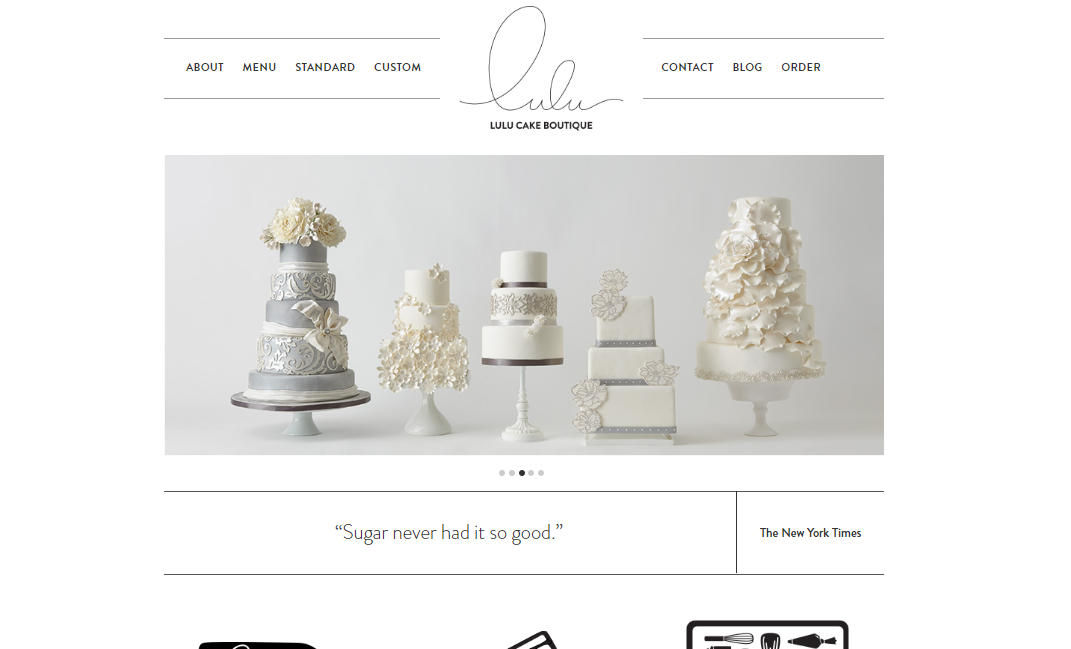
- Clean design.
- Image being first grabs the viewers attention and quickly conveys what the site is about.
- Not cluttered, easy to navigate.
harryanddavid.com/h/bakery
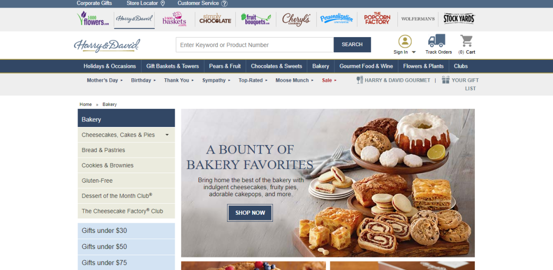
- Cluttered at the top of the page
- A lot of text
- Not much space between different aspects of website
- Feels closed in
vickybakery.com
- Catches your attention with image first, displaying their products of different kinds
grandcentralbakery.com

- A lot of text, not very eye-catching.
- Interesting wooden background with flour
whitesbakeryandcafe.com
- Links at the top of the page are too faint, not enough attention on them.
- Image too big.
beavertonbakery.com
- Far too text heavy, deters you from venturing further into the site.
-Emma O’Brien
